The Best Squarespace Template - Brine
The Brine template family consists of multiple templates that all share the same options for layout and design. The directions in the Brine guides apply to all templates in this family.
This guide offers an overview of the Brine family's features.
Special features
With templates in the Brine family, you can create a professional web presence for any brand or company, from a new boutique to an established retail business.
Parallax scrolling Index Page
The vertically-stacked Index Page uses parallax scrolling to create an illusion of depth and immersion.
Great for commerce
Advanced Commerce features include Quick View, product zoom, and on-hover effects.
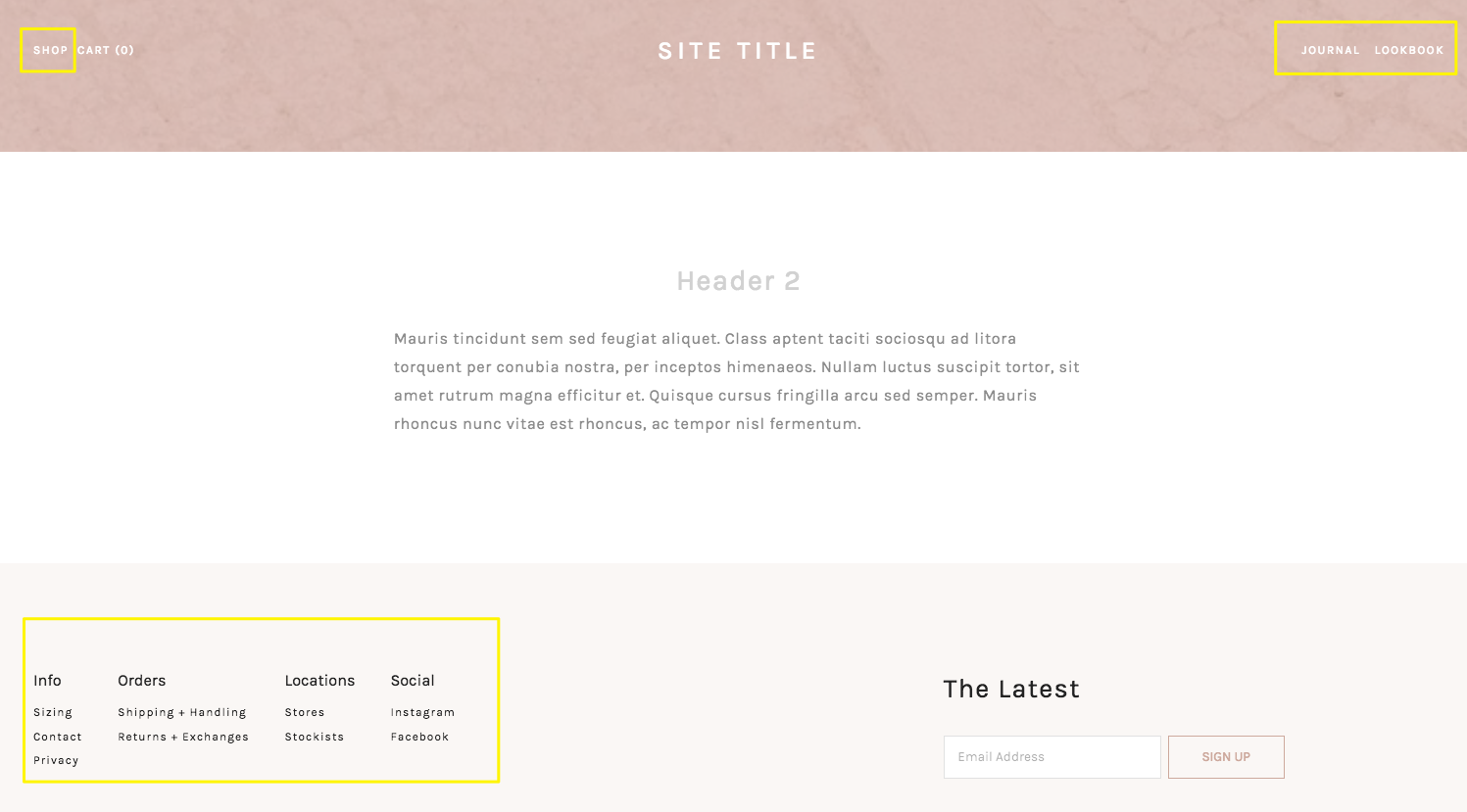
Multiple navigation areas
These templates support three separate navigation areas, all of which you can style independently.
Customizable mobile styles
Choose how your site appears on smartphones and other reduced-width browser windows.
Modern Blog Page
With two adjustable layout options, the Blog Page puts the emphasis on your images, videos, and content.
Content inset
A special inset for text and certain other blocks helps you create eye-catching layouts.
Site languages
In the Brine family, you can choose the language for your site's built-in text, such as submission forms and the Order Confirmed message.
If you haven't created a site yet, you can start with a French, German, Italian, Portuguese, or Spanish template.
Templates in the Brine family
The following templates are in the Brine family. All these templates share the same underlying structure and functionality. You can browse Brine templates in the template store.
Aria
Basil
Blend
Brine
Burke
Cacao
Clay
Custom Template - Sites built using the custom site builder are in the Brine family.
Ethan
Fairfield
Feed
Foster
Greenwich
Hatch
Heights
Hunter
Hyde
Impact
Jaunt
Juke
Keene
Kin
Lincoln (discontinued)
Maple
Margot
Marta
Mentor
Mercer
Miller
Mojave
Moksha
Motto
Nueva
Pedro
Polaris
Pursuit
Rally
Rover
Royce
Sofia
Sonny
Sonora
Stella
Thorne
Vow
Wav
West
Quick start
Certain tweaks and settings can make a big impact on how your site looks and behaves. Play with the following options until you settle on a design you love.
To open any panel, press the ? key and search for its name.
Site
From the Home Menu, click Design, then Site Styles.
These are some key tweaks that affect the whole site:
Header: Layout > Position tweaks
Header: Top > Background
Header: Primary Navigation > Style
Site: Border > Show Border
Main > Color
Footer > Layout
Index
An Index is a page of stacked sections. To get a feel for how your Index works:
From the Home Menu, click Pages.
Click + and add an Index Page.
Click Add Section and add:
Two Content sections
One Gallery section with at least 3 images
In the left panel, hover over over one of the content sections and click the Add a thumbnail image in the Media tab.
Next, go to the Home Menu and click Design, then Site Styles. Here are some key tweaks:
Index: Gallery > Layout, Aspect Ratio, and Spacing
Index: Gallery > Hover Style and Image Overlay
Main: Content Colors > Body Text and Body Text (Overlay)
Banner
Banners are images or videos that display at the top of your page.
From the Home Menu, click Pages.
Next to Primary Navigation, click the +, then click Page.
Give the page a thumbnail image.
Hover over the area below the header and click Edit to add some text to the Intro area. Hover below that and click Edit to add Page Content text.
You can add a banner like this to any Album, Blog, Events, Gallery, Products, or Regular Page on your site. You can also add a video URL instead of the page thumbnail to create a video banner.
Next, open Site Styles. Here are some key tweaks:
Header: Layout > Position tweaks - Try adding at least one header element to the Bottom header.
Main: Overlay > Enable Parallax and Overlay Color
Main: Content Colors > Body Text (Overlay)
Blog
First, create a Blog Page and add blog posts with thumbnail images. Then go to your Blog Page and open Site Styles. Here are some key tweaks:
Blog: List > Style and Image Aspect Ratio
Blog: List > Metadata
Blog: Metadata > Primary and Secondary
Blog: Typography & Colors > Title Color
Switch between excerpts and full post within Blog Page settings.
Mobile
Use Device View to see what your site looks like on mobile. Here are some key tweaks:
Mobile: Menu Icon > Menu Icon and Menu Icon Position
Mobile: Top > Fixed Mobile Top
Mobile: Top > Top Background
Mobile: Branding >Font or Logo Width
Overall the Brine family is one of the most robust template families that Squarespace has to offer. Comment on this post with a link to your favorite Brine template!


